TL;DR
The SIMs view is the heart of 1oT Terminal — it’s where customers monitor, manage, and troubleshoot their connectivity. Over the years, it had grown messy and unbalanced. We redesigned the experience to make high-volume SIM management easier, more efficient, and better aligned with how the product had evolved.
This redesign:
- Introduced powerful filtering and saved views to reduce repetitive work.
- Consolidated SIM data into one place for easier diagnosis and control.
- Rebalanced the layout to prioritize usability and scalability.
- Resulted in fewer support tickets and improved internal workflows.
Why this project mattered
The SIMs view is central to 1oT Terminal. It was useful, but it had become a patchwork. Every new feature added complexity. Every product evolution added friction. Eventually, the interface couldn’t keep up with our own ambitions.
This redesign wasn’t just a facelift. It was a chance to reset and design for the way our customers work now. And to make sure we’re ready for what’s next.
Framing the problem
When I first joined 1oT, this was one of the first interfaces I touched. At the time, it worked — barely. Since then, we’ve added new features and receive more information about each SIM from telecom partners whose APIs have improved over time.
Some of the problems we heard again and again:
- “I can’t filter by the data I care about — even though it’s in the table.”
- “I have to re-do my filters every single time I come back.”
- “I don’t know if my SIM is in session or not.”
The need for a redesign gradually became apparent as we launched new features and struggled to fit them in without making the experience feel disjointed.
The incremental way of building a product is hugely beneficial and necessary for a small team, but it unbalances the overall design. Each new capability adds stress to the existing surface for which it was designed.
What we changed (and why)
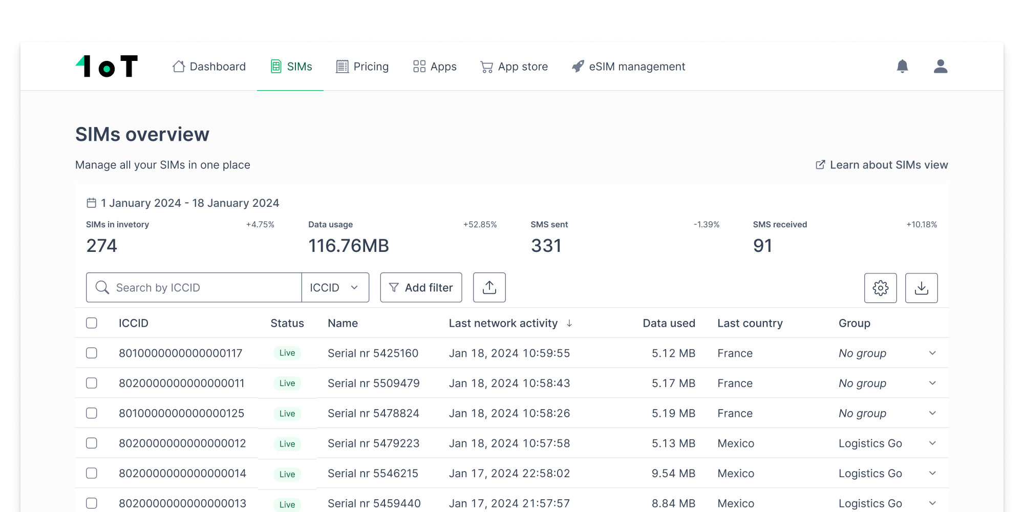
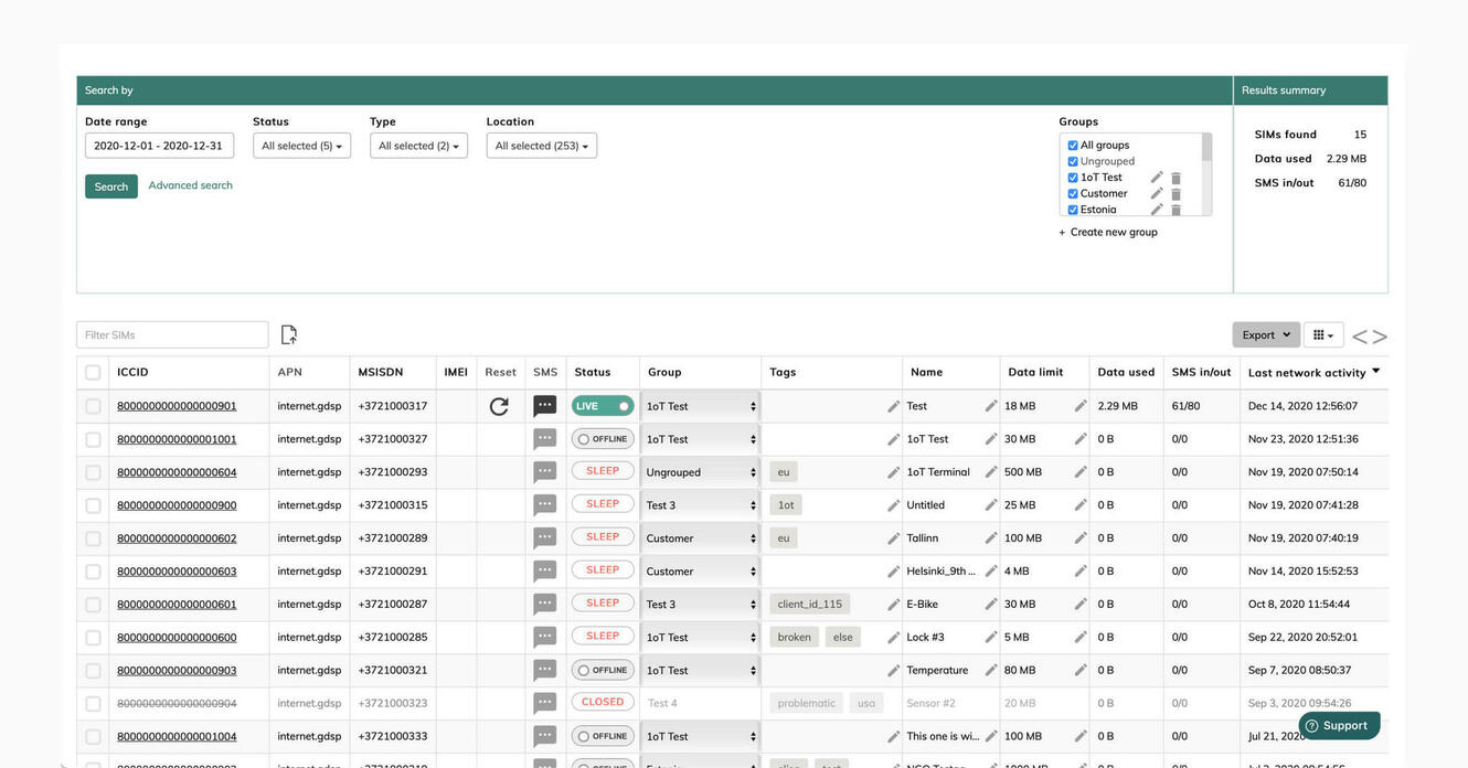
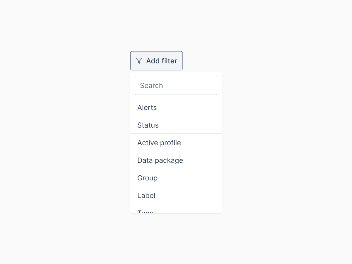
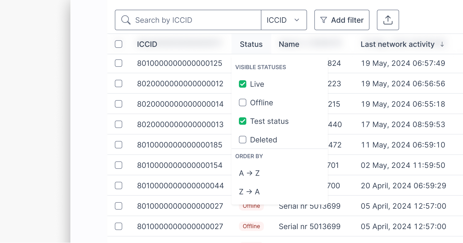
Smarter filtering
When I started the redesign, I first delved into the filtering puzzle and all of the data points that could be made visible.
The existing version had some shortcut filters at the top of the page, but the rest were hidden. Once opened, the filters consumed a significant amount of screen space.
A particularly annoying issue was the lack of support for filtering the increasing data points in the SIMs view. This led to instances where the data was present in the table, yet customers couldn’t filter it.
We opted for a filter button that filters step by step. Since we introduced so many new filters, I went through each data point in a Google Sheets file to identify filterable data, sorting options, and visibility of info in client and admin portal.
This minor design adjustment required extensive database work, which helped the engineers understand the tasks without miscommunication.
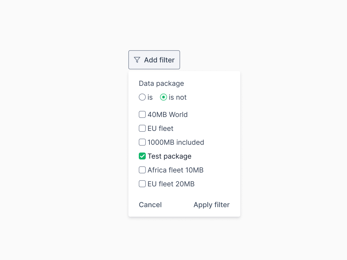
The second filter adjustment resulted from several prototypes.
I noticed it took a lot of clicks to select all options except one. To streamline this and reduce the number of clicks, we introduced a ‘is/is not’ selection for quicker filtering, enhancing the system’s efficiency.
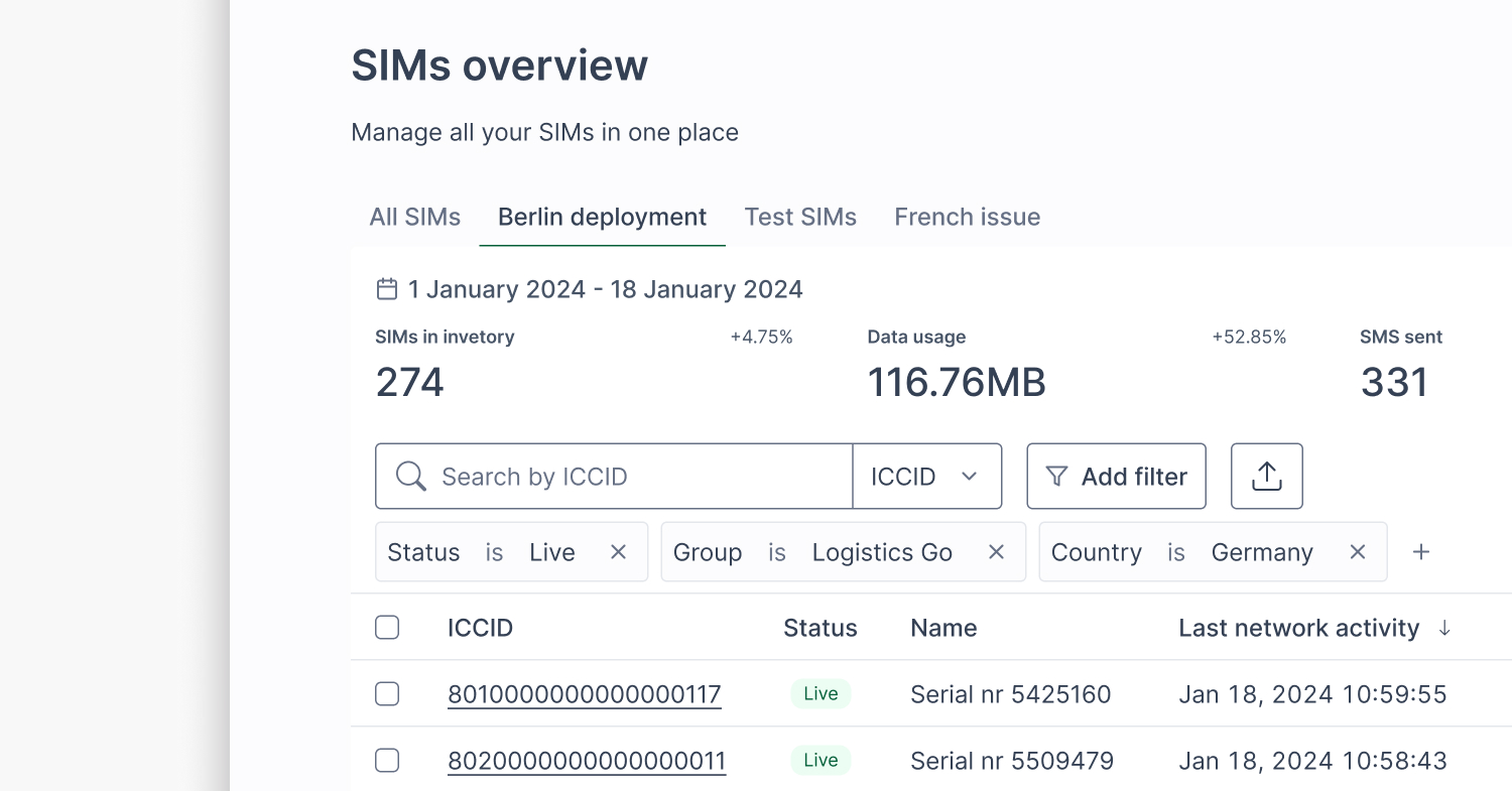
One last improvement in the third or fourth iteration was filtering from the table’s header. This is beneficial because of the fixed row in the scroll, with hundreds (if not thousands) of SIMs to manage. Filtering directly from the header saves time for power users.
Saved views
We received similar feedback many times in which people expressed the need to revisit the same collection of SIMs — especially when debugging, deploying, or tracking specific SIM groups.
The problem of seeing the same SIMs the next day or after closing the tab is tedious and time-consuming because you always have to filter them.
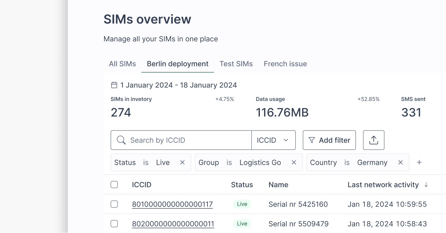
We added “Saved Views,” so users can save filter states and jump back to them instantly. It’s simple but saves a ton of time for frequent workflows.
To see saved views in action, check out this narrated demo.
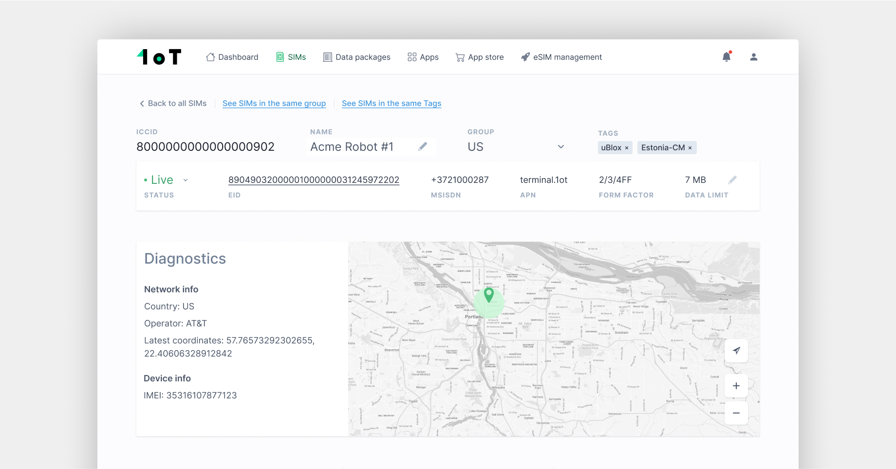
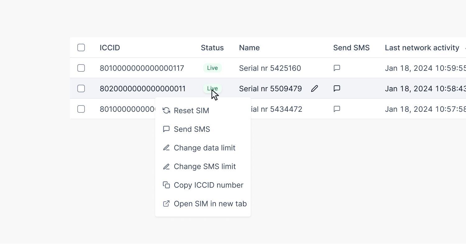
Context menu
Before my time at 1oT, introducing operations directly into the SIMs view table was a significant improvement compared to existing connectivity management platforms.
Every SIM action (like reset, send SMS, change status) had its own column. Over time, the range of possible actions, similar to filters, has expanded. This has led to an unhealthy balance between information about the SIMs and actions. Plus, the repetitive action columns cluttered the SIMs table visually.
Yet it was clear from conversations with customers that having those actions nearby is of significant value.
A small revelation came when I remembered a blog post from Height about context menus. So, I designed a menu for 1oT Terminal.
I aimed to improve the user experience by providing quick access to critical SIM management operations for each SIM without compromising the table space. I removed all action columns in one prototype to test the interest in a different approach.
The feedback indicated that the context menu is less familiar to our customer base. We also recognized that teaching this new pattern is a challenge on which we didn’t want to spend time.
Through prototyping and testing, we found a middle ground:
- Keep key actions in the context menu.
- Let customers choose which action columns they want visible.

This gave us a cleaner default while supporting power users who want control.
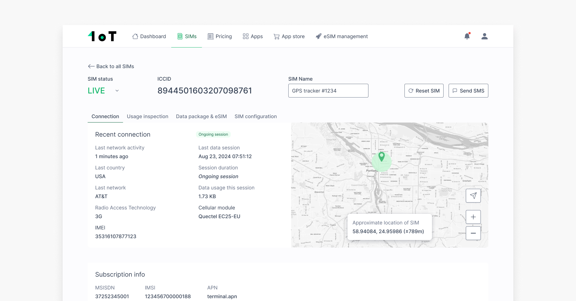
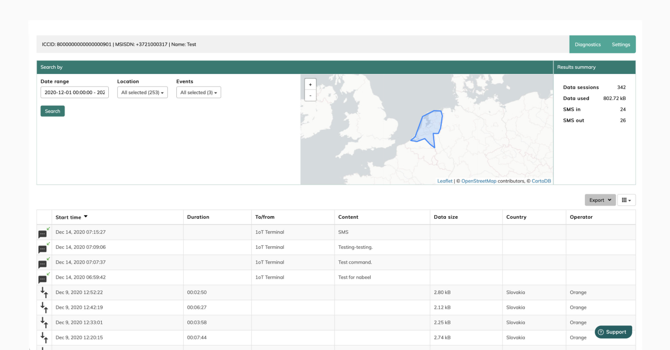
One place for all SIM data
1oT’s guiding principle for its connectivity management platform is the availability of real-time data so that customers can manage their connectivity without any help.
One pain point we identified was that the SIM detail view only showed current SIM activity. To troubleshoot a single SIM, you had to switch between views. The SIM details were scattered.
We consolidated everything into a new SIM detail layout:
- Tab 1: Live status and static info
- Tab 2: Detailed usage logs and event-level insights
- Tab 3: eSIM profiles
- Tab 4: Configurable SIM settings


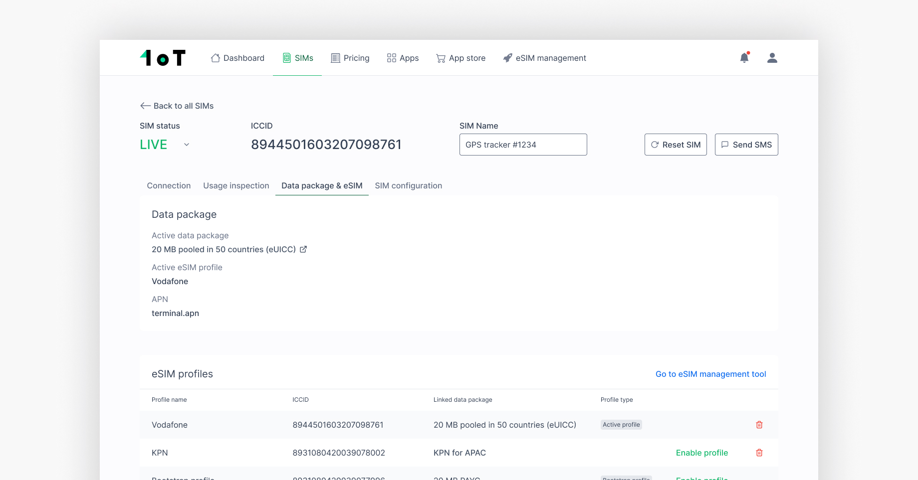

This gives users a holistic view — no more guessing or digging.
Plus, we added visual status icons to make it easier to spot issues at a glance.
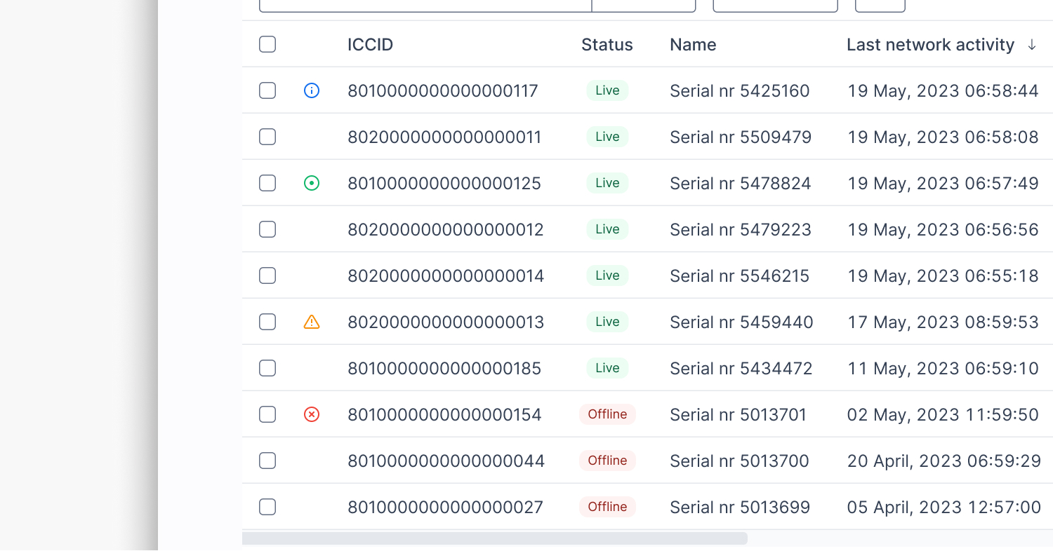
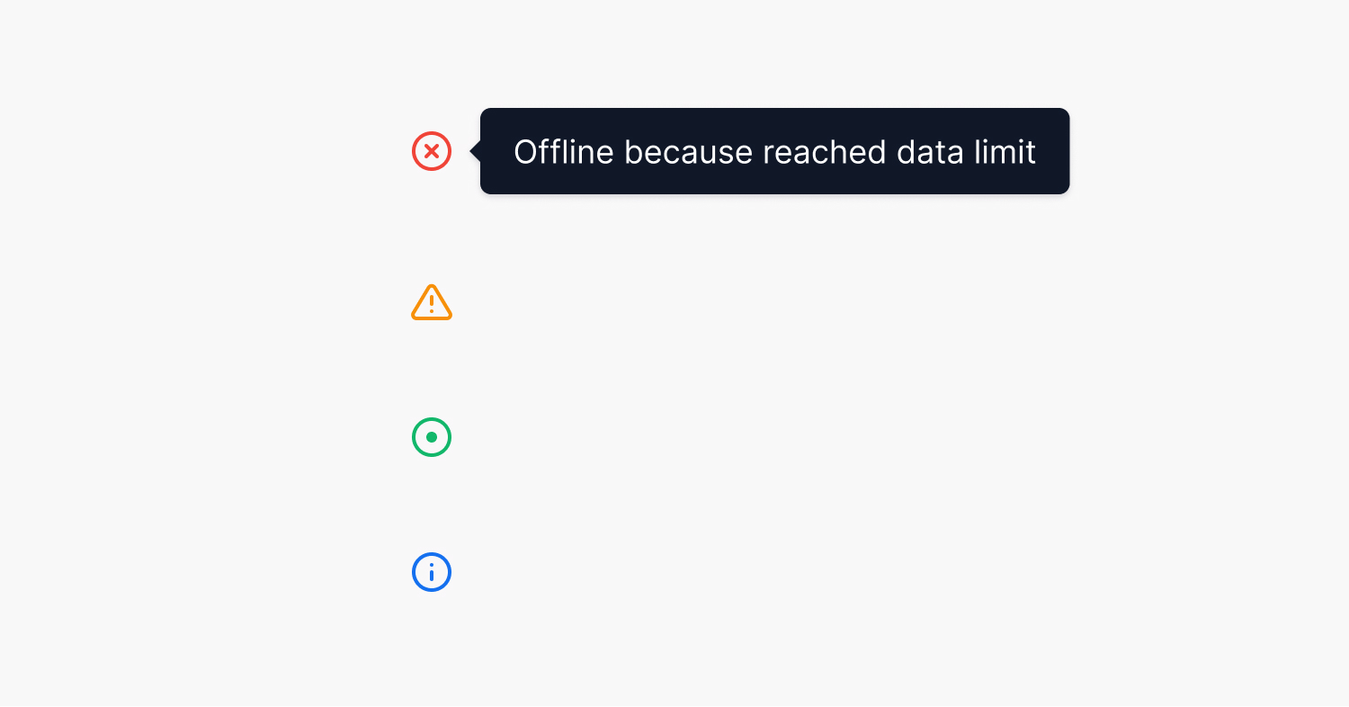
- Red X: This indicates that the SIM card is offline because an SMS or data limit was reached or because it’s in a different device.
- Orange exclamation mark: This indicates an ongoing API request to a partner to resolve any uncertainty about the SIM card’s current state.
- Green dot: Indicates that the SIMs are actively consuming data in a session.
- Blue exclamation point: This indicates that the Intelligent Connectivity feature detected an anomaly in the SIM card’s usage pattern.
These indicators play a crucial role in customers’ daily operations. They help customers identify problems or explain unexpected SIM behavior quickly.
What I learned
This project reinforced a few lessons I keep coming back to:
- Design debt slows everyone down. It’s easy to ignore until it becomes a daily pain.
- Iteration > assumptions. Some of my favorite ideas flopped in testing — and that’s okay.
- Power users need power tools. But the default experience still needs to be welcoming.
Redesigning the SIMs view wasn’t just about polish, it was about trust. Making sure our customers can rely on 1oT Terminal as their daily tool. Making sure our team can keep shipping without breaking things. It set a stronger design foundation for future features — instead of layering on more UI debt.
This case reminds me that good design doesn’t just make things look better. It makes things work better — for everyone.