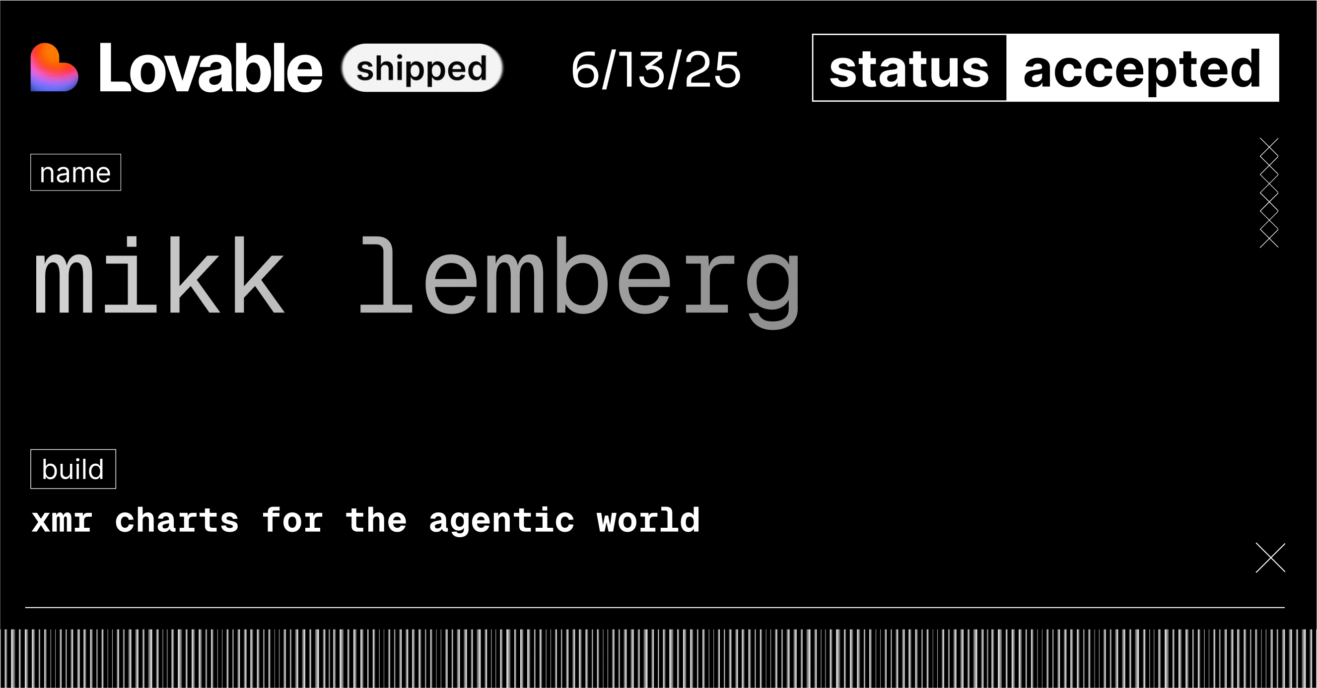
I got into the Lovable Shipped program. Starting from Monday, I have six weeks to build something real. The tool is called Zenkai to help separate signal from noise in your business metrics.
The problem: When numbers lie
Picture this: You’re tracking lead conversions on your website. Monday it’s 12%. Tuesday it drops to 8%. Wednesday jumps to 15%. Thursday back to 9%.
Which changes actually matter? Was Tuesday’s drop a real problem or just random variation? Did Wednesday’s spike mean your new landing page worked, or was it just luck?
Most dashboards can’t tell you. They just show you wiggling lines and hope you’ll figure it out.
I lived this frustration every Monday morning for years, staring at Chuck Taylor sales numbers, hoping for the best but never knowing if a bad week meant something was broken or if I should just wait it out. No way to control the system. No way to know what to expect.
The solution: XmR charts cut through the noise
XmR charts work like a thermostat for your metrics—they learn what “normal” looks like for your specific business and only alert you when something genuinely unusual happens.
Instead of just showing you numbers, they draw clear boundaries around your data. Think of it as your metric’s natural breathing room. Anything within those boundaries is normal variation, the kind of ups and downs every business experiences. Anything outside those boundaries is a real signal that something changed in your system.
Tuesday’s 8% conversion? If it stays within the boundaries, it’s probably just your business having a normal Tuesday. Wednesday’s 15%? If it breaks through the upper boundary, something actually improved—time to investigate what worked.
Why Zenkai exists
Most people don’t know XmR charts exist. The ones who do find them intimidating—full of statistical jargon and PhD-level mathematics. But the core insight is simple: your business metrics aren’t random. They’re part of a system, and you can learn to read that system.
Zenkai makes this accessible. I want to bring “calmness to the workspace” by helping you see patterns instead of panic over every fluctuation.
The name plays on Japanese concept Kaizen—continuous improvement through small, measured changes. Not the endless optimization hamster wheel, but intentional progress guided by understanding what actually moves your metrics.
What I’m committing to
I’ve been sketching versions of this tool for years, waiting for the “right moment.” The Lovable program gives me exactly what I need: constraints, community, and a deadline that forces me to ship something real.
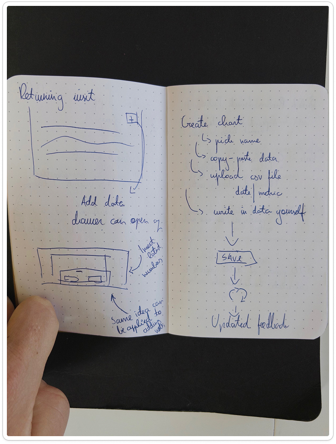
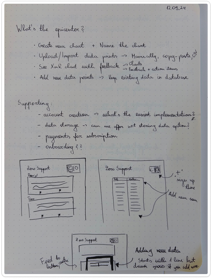
In six weeks, I’m focused on one thing: an intuitive XmR chart tool that anyone can use, no statistics degree required. If you can read a line chart, you can understand when your metrics are telling you something important.
- Work in public: Weekly updates on decisions and challenges I’m working through
- Ship a working product in 6 weeks: An XmR chart tool that brings clarity to business metrics—you upload your data, get instant signal-vs-noise insights
- Demonstrate that good design can make PhD mathematics approachable: Signal over noise, understanding over overwhelm
Time to build. 🏗️